After about two weeks of urging by my daughter, my wife and I went to see the second "Twilight" movie, "New Moon". Em asked me if I might blog about my thoughts on the movie, so -- at the risk of offending her, given that she is a big fan of the franchise (she's already seen "New Moon" half a dozen times) -- I will give it a shot.
To start out with, I should state up front that I am clearly not a member of the intended audience for this movie -- I think I'm about forty years too old… and I'm a guy.
One of my basic criteria for judging whether a movie is good or bad is whether I get bored during the viewing. I didn't get bored watching "New Moon", but I came close a few times, especially during those seemingly interminable close-ups of Bella and Edward or Bella and Jacob where they mumble dialogue about love and such. None of these conversations ever seem to really GO anywhere, with the possible exception of Edward's surprising offer to Bella at the end of the movie.
Now, in a movie featuring vampires and werewolves, especially in this day and age, one expects the creature effects to be of a high quality. I was initially pretty disappointed in the werewolves, and not just because of their design (I'll say more about that in a moment), but because in their first couple of appearances on screen they looked almost comical to me with the way their snouts bunched up. Eventually, though, the animators got it together and they looked a lot more polished and integrated into the scenery through the rest of the movie.
However, I have a big problem with werewolves that essentially look like wolves, even really BIG wolves. It's just not that interesting to me. During the big scene where Jacob in his werewolf form is battling another werewolf to protect Bella, it just looked like a big dog fight. Well-done, yes, but really too much like watching too big dogs battle each other. I would have preferred the much cooler and creepier man/wolf approach as exemplified by Rob Bottin's great work in the original "The Howling" movie. It would have made the vampire vs. werewolf fights in "New Moon" a lot more interesting, in my opinion.
And speaking of those fights -- at one point, Jacob says -- in response to Bella's comment that the vampires are really fast -- that the werewolves are even faster. Really? If what you see on the screen is any indication, that can't possibly be true. The vampires are so quick that they appear to be able to move across dozens of yards of distance instantaneously. The werewolves, on the other hand, appear to be able to run on all fours as fast as animals their size might be expected to, which is nowhere near "instantaneously" fast. If there had been something else to this -- like if Jacob had said something about how the werewolves can do the pack hunting thing better than the vampires, and it had actually been shown on the screen -- the whole werewolves chasing down and catching vampires thing would have worked a lot better. As it is, I didn't believe any of the werewolves seen in the movie could have caught any of the vampires except by sheer luck.
I also have to say that the "shirtless dude" look favored by the werewolves when in their human form got pretty silly after a while. It seemed to be something they did so that when they transformed into werewolves their clothes wouldn't be ruined… but the always left their pants on. I don't get it.
I also didn't get the rules of interaction between the vampires and the werewolves, which were very sketchily presented. This movie could have done with significantly more exposition, perhaps at the expense of a few of those scenes of Bella looking soulfully at Edward or Jacob.
Or maybe the point is that not only do you have to be a young person, and preferably female, but you also have to read the source novels to really get the most out of movies like "New Moon". I'm tempted to try, even though I have not heard great things about them, but I think for now I'll stick with Charles Dickens.
If I were to give this movie a letter grade, it would be a "C". Or maybe a "B-", because although I didn't care for the werewolves' designs that much, there were two very cool quick bits where all you see of them are looming black shapes in the underbrush with vapor coming out of their nostrils. That was pretty nifty. -- PL
All artwork, photos and text © 2010 Peter Laird, unless otherwise noted.
Wednesday, November 25, 2009
Thursday, November 19, 2009
Nice light through clouds from bike path in Hadley
A few weeks ago, I was pedaling back from Amherst on the bike path in the late afternoon, and stopped at a road crossing in Hadley to take a photo -- actually several photos -- of some clouds off to the west dramatically pierced with shafts of sunlight. I put them together into this partial panorama.

While the lighting in this image pretty much captures the scene as it was, and encapsulates that sense (at least for me) of too-early dusk and the feeling of approaching winter that one gets here in early to mid-November, I was also a bit disappointed that much of the landscape was rendered too darkly, obscuring a wealth of detail. So I decided to do a little "quick and dirty" Photoshop manipulation with a fast selection and use of the "Brightness/Contrast" image adjustment menu, which gave this result:

As I said, it's a "quick and dirty" effort, but it once again reminded me of what an incredible program Photoshop is... this effect took all of two minutes to accomplish. -- PL
Saturday, November 14, 2009
"Under the Dome"... into the recycling pile
I admire Stephen King greatly. I have read pretty much all of his novels, with the exception of the later "Dark Tower" books and "Lisey's Story" (which I started, got about ten pages into, and just couldn't continue). I think "The Stand" is one of the best post-apocalyptic stories ever, "'Salem's Lot" one of the best vampire stories ever, and "It" one of the best "weird monster terrorizing kids in the sewer" stories ever. I've really enjoyed the majority of the Stephen King books I've read, including the ones under his pseudonym, "Richard Bachman".
But yesterday I did something with a Stephen King novel that I'd never done before -- I skimmed it.
I'm referring to the huge (almost 1100 pages) new novel "Under the Dome", which came out a few days ago.
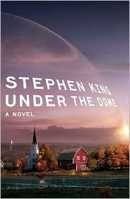
I picked up my copy at the Barnes and Noble in Hadley on Thursday, and eagerly dove into it, setting aside "David Copperfield", which I had just started reading (I'm on a bit of a Charles Dickens kick).
About thirty pages into the book, I started to feel uneasy. No, it wasn't because there was anything particularly scary or creepy in the story (something you very often run into with King's tales, and that's a good thing). No, the reason was… I was bored. There was a fascinating set-up -- a small town is suddenly and mysteriously covered by an impenetrable dome (actually, it's not REALLY shaped like a dome, regardless of what the cover art depicts, but that's a minor point). But as I read on, I discovered that the cast of characters, especially the bad ones, seemed plucked from other King works.
And from then on, the action became fairly predictable. I was disappointed -- I was looking forward to getting immersed in an interesting exploration of what might happen to the people of a town put into this bizarre predicament. But by this point I had completely lost interest in the book, except for one thing -- I wanted to find out if the dome ever went away. So, with close to a thousand pages left to go, I skimmed all the way to the end, and found out.
Why did I bother skimming, and not just go to the last few pages? Well, as I have almost always had good luck with Stephen King's novels, I thought that MAYBE as I skimmed along I might spot something which would pull me back into the story, and cause me to slow down and start reading normally again -- maybe even go back to where I started skimming and read from there. Alas, it was not to be. -- PL
Friday, November 13, 2009
Blast from the Past #253: My first Duo-Shade drawing (I think)
I'm pretty sure this was the first illustration I ever did using Graphix Duo-Shade board, the paper on which Kevin and I would later draw most of the early TMNT comics. The tones -- especially the light ones -- on this particular drawing have faded somewhat, as they sadly tend to do on Duo-Shade originals. I think it has something to do with the nature of the chemicals which combine to make the tones.

I think this was probably done in the late 1970's, and quite possibly for "Hampshire Life". -- PL

I think this was probably done in the late 1970's, and quite possibly for "Hampshire Life". -- PL
Tuesday, November 10, 2009
Blast from the Past #251: "Vegetable Wheel" Hampshire Life cover
This is one of my favorites of the covers I did for Hampshire Life, and if memory serves it was one of my editor's favorite, too. I like it for the drawing, which I think came out well, but also for the fact that it was one of those rare times when the art was meant to be USED.
.jpg)
This was intended not only as a cover illustration, but as the front of a practical "wheel"-type guide for planting and harvesting vegetables. The black rectangles in the drawing, labeled "Type of Vegetable", "Time to Plant" and so on, were meant to be windows through which the appropriate information could be shown. The second part of the "wheel", containing that information positioned so it would appear behind the correct window, was printed inside Hampshire Life, as were the directions for making the "wheel". (Those were basically to mount the two pages on two sheets of stiff cardboard, then cut them out -- including the windows -- and join them together in the center with a paper fastener. In the printed version, I think a small dot was added in the exact center to make assembly easier. Note the small indent on the right hand side -- this was meant to be cut out, along the dotted line, so as to make turning the wheel with the instructions on it a bit easier.)
I've always wondered how many people actually put this thing together. -- PL
Sunday, November 8, 2009
Blast from the Past #250: Chickpeas and lentils
Here's another pen and ink stipple piece (with a little bit of white-out) from the late 1970's/early 1980's. It's one of a number of vegetable drawings I did back then for "Hampshire LIfe", some of which ended up being used on the menu of one of my favorite restaurants in Northampton, Paul and Elizabeth's.

This was drawn from life -- I bought some dried chickpeas and lentils for reference. I remember being amazed at how convoluted the surface shapes of the chickpeas were. -- PL

This was drawn from life -- I bought some dried chickpeas and lentils for reference. I remember being amazed at how convoluted the surface shapes of the chickpeas were. -- PL
Saturday, November 7, 2009
Blast from the Past #249: Tea party
This is another piece I did for Hampshire Life, back in the late 1970's or early 1980's. -- PL


Friday, November 6, 2009
What lies beneath
Easthampton, MA is just a few miles south of Northampton. It's a nice little town. It has a lovely pond in the middle of the town, one I have enjoyed walking around and occasionally over (when it's frozen in the winter).
Recently, for reasons unknown to me, the pond was drained. It's been this way for several weeks, and a few days ago I happened to stop and take some shots of a view which I might never see again. I put them together into this little panorama, looking south across the pond from Cottage Street.

I've always found this kind of thing fascinating -- a glimpse of a secret world, revealed. -- PL
Wednesday, November 4, 2009
Fall is here...
As we enter the first week of November, we face the winding-down of the motorcycling season. The air is getting colder, the leaves have fallen from many of the trees and the wooded landscape is beginning to take on the somewhat skeletal appearance of late fall. But it hasn't snowed yet, and there are still a few times to get out and take a short ride.
Such an occasion was enjoyed by me last week, when unexpected warm temperatures and blue skies beckoned. I took the Victory out to Pittsfield and, on my way back on some roads I am only slightly familiar with, pulled over when I spotted this location.

It looked like a fine spot to stop and eat my lunch... and it was. -- PL
Monday, November 2, 2009
Blast from the Past #247: Fertility symbols
This is one of my favorite drawings from my freelance days. I'm pretty sure it was commissioned by and published in "The Real Paper", a somewhat short-lived "alternative" weekly paper out of Boston, MA.
+--+fertility+symbols.jpg)
I did this during my "stipple" period. -- PL
+--+fertility+symbols.jpg)
I did this during my "stipple" period. -- PL
Sunday, November 1, 2009
Tricky treat
Hallowe'en is now officially over for 2009, and I hope everyone who celebrated it had a great time. While going through a batch of files today, I stumbled across this funny illustration relating to the holiday that I drew years ago (back in the 1970's) for the "Hampshire Life" weekly supplement to Northampton's newspaper, "The Daily Hampshire Gazette". This was probably drawn for one of several columns I regularly illustrated -- probably "Life Line".
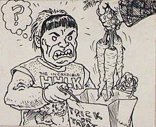
The thing I like most about this piece is how the grimace on the cheap molded-plastic "Hulk" mask accurately captures the likely disappointed reaction of the kid wearing the mask, who is given carrots instead of candy on Hallowe'en. -- PL
P.S. -- Don't forget to set your clocks back one hour today! (For those of you in "daylight savings time" regions.)
Subscribe to:
Posts (Atom)